
這是歷史版本頁面 — 看 Balsamiq Mockups 最新版本
Balsamiq Mockups 畫線框圖還夠用嗎
 Balsamiq Mockups 3.3.1
資料更新 2015-12-03
閱讀約 5 分鐘
你正在規劃一個新功能或新頁面,腦子裡已經有大概的輪廓,但打開 PowerPoint 或 Figma 想畫出來時,卻發現自己卡在「要選什麼顏色」「字體多大」這些細節上,半小時過去了,版面還沒排出來。你只是想讓團隊看懂「這裡有個按鈕、那邊放一張圖」,卻被迫先當一個視覺設計師。這種時候,你需要的是把想法快速倒出來、讓大家討論功能而不是美醜的工具。
一般人的直覺是打開繪圖軟體或簡報軟體來畫,但這些工具的精細度反而成了阻礙——太容易分心在視覺細節,而且修改版面很費工。另一條路是拿紙筆畫草圖,但紙本無法分享給遠端同事,也無法建立多頁流程。於是出現了一種折衷做法:用數位工具模擬手繪草圖的質感,刻意保持「未完成」的樣貌,讓討論焦點鎖定在功能與架構上,而不是顏色和字型。
01Balsamiq Mockups 到底能做什麼?
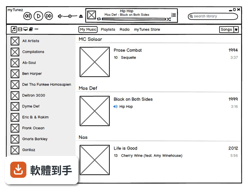
它是一套快速建立線框圖(wireframe)的工具,用來在產品開發初期畫出網頁或 App 的版面草稿。你從左側元件庫拖曳按鈕、文字方塊、圖片框等到畫布上,排列出頁面配置,再用連結功能把多個頁面串起來,變成可以點擊的簡易原型。畫出來的成品是手繪風格,看起來像草圖,目的是讓討論聚焦在功能與動線上。
02它和一般設計軟體畫出來的東西有什麼不同?
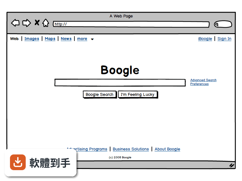
最大的差別在於「精緻度」。Figma 或 Adobe XD 這類工具做出來的是高傳真設計,顏色、字型、間距都接近最終成品;Balsamiq 刻意維持低傳真的手繪感,讓觀看者不會被視覺細節帶走,專注在版面結構與功能邏輯。如果你需要跟客戶確認「首頁要放哪些區塊」,用 Balsamiq 比用高傳真稿更不容易失焦。
03能不能做出可以點來點去的原型?
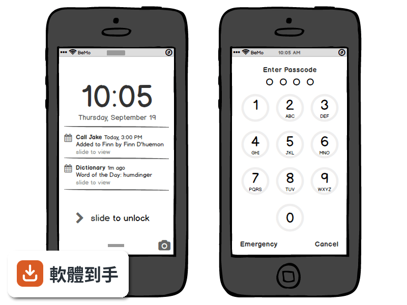
可以。你可以在不同頁面之間建立連結,做出點擊按鈕就跳到下一頁的效果,用來模擬使用流程。這對於使用者測試或向利害關係人展示動線很有用。不過它的互動能力僅限於頁面跳轉,不支援複雜的動畫、條件式邏輯或動態資料,這點要先有心理準備。
04畫好的東西要怎麼給別人看?
可以匯出成 PNG 或 PDF。PDF 匯出時會保留頁面之間的連結,對方在 PDF 閱讀器裡點擊就能跳頁,適合用來做簡報或寄給客戶確認。如果你想要更進一步的協作,可以考慮它後續推出的雲端版本,但這套桌面版本身沒有內建多人即時共編功能。
05多人一起用的話,它怎麼運作?
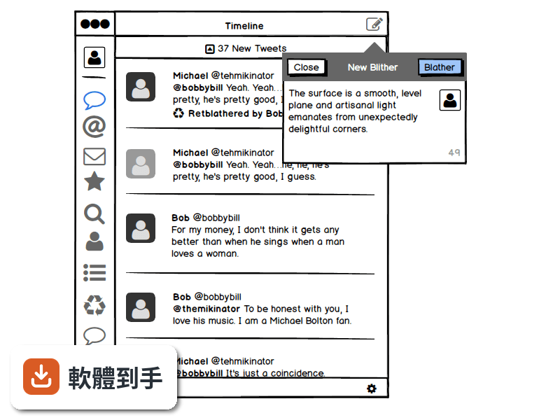
這套桌面版沒有即時協作功能,團隊要分工的話,比較常見的做法是各自畫好自己的部分,再合併討論。不過它支援建立可重複使用的元件庫(Symbols),團隊可以先定義好共用的按鈕、表單等元件,大家畫圖時直接拖出來用,確保一致性。註解功能可以讓你在圖上加註意見,方便非同步溝通。
06不會寫程式的人用得了嗎?
可以,這正是它的設計目標之一。操作方式就是拖曳元件、調整大小、輸入文字,不需要任何程式背景。官方說明也提到,任何人只要會用滑鼠就能上手。產品經理、專案經理、業務人員都可以用它來表達想法,不需要等設計師有空才能動工。
07產品經理或開發者適合用嗎?
適合。產品經理可以用它快速把需求視覺化,跟工程師溝通時有個具體的參考依據,減少「我說的是這個意思嗎」的來回確認。開發者也可以用它先畫出介面草稿,確認版面與流程後再開始寫程式,避免開發到一半才發現動線有問題。它特別強調「在流程最早期的時候迭代,成本最低」這個概念。
08它和 Figma 或 Adobe XD 比起來如何?
定位不同。Figma 和 Adobe XD 是完整的高傳真設計工具,適合做最終視覺稿、設計系統、交互動畫;Balsamiq 只做低傳真線框圖,功能範圍小很多。如果你的工作流程需要先快速確認功能架構,再進入視覺設計,Balsamiq 可以當作第一步;但如果你需要的是直接做出接近成品的設計稿,它幫不上忙。
09這套舊版還值得用嗎?
這套 Mockups 3 for Desktop 已經停止更新,官方把後續版本改名為 Balsamiq Wireframes,並表示舊的 BMPR 檔案格式可以繼續沿用。也就是說,如果你手上已經有這套軟體、檔案也都是這個格式,繼續用沒有問題;但如果你是要新開始使用,官方建議的長期方案是更新的版本或雲端服務,因為舊版不會再有新功能或修正。
10有沒有其他更多人用的選擇?
在線框圖這個領域,Balsamiq 是知名度很高的老牌工具,但它的評分人數只有 80 人,相較之下 Avocode 有 144 人評分、Google Web Designer 有 74 人評分。如果你在意的是社群規模或長期維護,可以參考這些替代方案,或是直接考慮 Figma 這類免費且活躍的設計工具。另外要注意,這套軟體只有英文介面,授權型式是 Trial,使用前需要確認試用限制。
下載與官方連結
Balsamiq_Mockups_3.3.1.exe · 3.8 MB · 連結指向軟體原廠
版本紀錄
- 2020-03-13 Balsamiq Mockups 4.0.26 69.95 MB
- 2019-02-12 Balsamiq Mockups 3.5.17 15.3 MB
- 2018-08-09 Balsamiq Mockups 3.5.16 15.3 MB
再看 5 筆
- 2018-08-05 Balsamiq Mockups 3.5.15 14.44 MB
- 2017-07-06 Balsamiq Mockups 3.5.14
- 2017-06-23 Balsamiq Mockups 3.5.13 14.41 MB
- 2017-06-22 Balsamiq Mockups 3.5.12 14.41 MB
- 2017-06-21 Balsamiq Mockups 3.5.11 14.41 MB
這一版改了什麼
What's new in this version:
A New Way to Organize Your Mockups:
- This has been one of our most requested features for years, and we've finally done it! You can now organize your mockups in groups, creating a simple parent/child relationship between them, just by using TAB and SHIFT+TAB. If you've used Powerpoint or Keynote before, this will feel very familiar to you
- This feature is useful for projects of all sizes, but it especially shines with larger projects
- As you can see at the end of the video, we also increased the size of the thumbnails in the Grid view, to make them more recognizable at a glance
- Thank you so much afeinman and all the others who contributed to the feature request, as well as JeromeR, Trevor A. and Andrei B. via email
Better Sizing of Thumbnails:
We now resize the thumbnails in the navigator proportionally, instead of just horizontally like before. Take a look:
- This works for Assets thumbnails as well, so if you want to see your images nice and big, now you can!
Big Boy Arrows:
- The term "big boy arrows" comes from our friend and long-time-power-user Adam Wride, who used it in the Balsamiq Interviews eBook to describe what he wished our Arrow control would behave like
- Well, our arrows have finally grown up! You no longer have to fiddle with weird property inspectors about direction and curvature, you can simply drag the ends where you want them to be, and drag the middle control point to specify the curvature
Take a look, it's so simple now:
As you can see, the property inspector has been simplified, and we even added a couple of highly requested features:
- As you can see in the video below, you can select either a curved arrow or one made of straight lines, and you can double-click on the middle control point to make the arrows straight or at a right-angle. Handy
- You can also adjust the position of the arrow's label, another highly requested feature
- We also, FINALLY, fixed the clipping bug for arrows when exporting them to PNG or PDF
- Thanks so much to all the people who requested these improvements over the years! You're too many to list, but you know who you are
"Back" Meta-Link:
- This is another little feature that's been requested for years. In short, you now have the ability to create a link that goes to the previous page visited while in Full Screen
This is especially useful for modal dialogs that have to be invoked from different screens, as shown in the little video below:
- Due to technical limitations of the PDF format, this feature will sadly not work in exported interactive PDFs
- Thanks for all those who requested this over the years!
New "Link to a New Duplicate of This Mockup" Functionality:
- We added the "Link to a New Mockup" feature a while ago. Today, following a good idea by ariley, we're also adding a variation that duplicates the current mockup instead of creating a new blank one. Handy
We Now Remember Zoom and Scroll Settings across Restarts:
- Another little but highly requested feature. We now do a better job at re-creating the exact situation you were in when you last closed a project, by saving zoom level and canvas scroll position on a cookie on your computer
- Thanks mikecimelli, melogranato and megdesilva, Matt, Alex R., Andrew K., Visnja Zeljeznjak, Steven S., Mark G., Bob J. and others for requesting this
20 New Icons from FontAwesome 4.5:
- We incorporated the newly released version 4.5 of FontAwesome, which comes with 20 new icons and a bunch of little fixes here and there (see details)
- With this update, we were also able to improve how some 2.2 icons in BMMLs are converted when imported into v.3
Other Improvements and Bug Fixes:
- Resizing a selection from the top-left corner made the right side of the selection flicker. That's now fixed
- Similarly, drawing controls with R, T or Y from bottom-right to top-left made the right side of the new control flicker. This is now also fixed
- We improved how the button control works when small. Thanks wichase for your assistance
- We fixed an issue in the Data Grid where the text in the first row might be white instead of black when the header row was off, nothing was selected and the project selection color was dark
- Fixed an issue in the Data Grid showing a selected row at the bottom even after the text for that row was deleted
- The Property Inspector for Data Grid controls now says "Data Grid" instead of "List"
- We fixed an issue with the List control not displaying properly when the font size was very big, some of the text "spilled over" the bottom of it
- We fixed an issue with icons getting underlined when a control's text was set to underlined. Thanks heringsfilet for reporting this
- Dragging mockups between projects now also brings any alternates along